Insights from a museum educator at the Art Institute of Chicago

Friday, December 17, 2010

Have a Seat!


On Wednesday of this week fellow Fellow in Museum Education, Kate Moioli, gave an express gallery talk on the Art of Chairs. Her choices inspired me to revisit my favorite pair of chairs in the Art Institute, a pair of musician’s chairs from the 18th century.

I have always been drawn to these petite perches for the posterior because they embody everything social about the 18th century interior. These would lend an air of luxury and elegance to the home is ways beyond the rich materials used (the original leather upholstery is a finely dyed red) but in its skill and craftsmanship as well. The artisan has carved and ornate, ribboned vegetal design on the fronts and backs of the chairs. But, as the scholar Mimi Hellman has discussed, there was luxury (a joy in fact!) to owning sets! In this day of mass production we are apt to forget that to create an identical series of the same object requires more than just molds, patterns, and exact measurements. Each object is unique, with its own set of problems (err, features) be it grain, warping, dryness and any other  natural occurrence that comes about in the process of growth. It’s the same reason why, as a potter, you’ll never receive a tea set or set of bowls from me as a present.

That said, the joy of owning sets went beyond the mere expense and showiness of the home’s décor. In the 18th century hundred of pamphlets and manuals on the art of furniture arrangement were published (think: the predecessor of the feng shui craze in mid-American households in the 1990s). The lady of the household could make or break social encounters merely by the coy placement of a settee or pair of chairs. A marriage proposal or physical rebuff could be facilitated by a chair cornered just so. It was a testament to the social elegance of the woman who arranged her own interiors. What is fascinating about these chairs is that their décor is our first clue as to how and where these were meant to be placed. Though they are called musician’s chairs, I have my doubts if that name refers to their actual function. In looking at the object as a whole one finds that the most elaborate decoration is on the backs of the chairs. So that presents a tricky problem for how place them in the room—one certainly can’t face their guests to the wall! Unless…you see, there are two of these chairs. It could only mean that they are meant to face each other and away from the main action of the room. Oo la la!

18th century European interiors followed the fashion of the French court and the style in the late 18th century was dominated by Louis XV and the maîtresse-en-titre (the officially titled royal mistress), Madame du Pompadour. The Madame du Pompadour designed tiny, intimate worlds for the king to escape from the world of politics (which were getting quite sticky!), small hunting lodges, tiny private theaters and small gatherings of choice guests. These types of private encounters needed a new form of furniture, a kind that was so drastically different from the very majestic, grand and public style of court held by Louis XIV.

These chairs could be arranged to facilitate a whispered conversation while still allowing the sitters to turn around and briefly join the wider conversation(s) throughout the room. The low backs also allowed the wide carriages of stylish dresses (see images from the Metropolitian Museum of Art’s exhibition, Dangerous Liaisons: Fashion and Furniture in the 18th Century.) Imagine how the body must position itself to balance yourself and your clothing on this teeny perch. It would take a great deal of elegance and graceful movements. One awkward move would expose any façade of gentility!

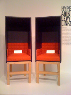
The intimacy of these two chairs reminds me of another pair of chairs on view right now in the Art Institute. In the recently installed Hyperlinks exhibition in the Architecture and Design galleries are two chairs designed by Arik Levy called Confessions (2010). They allow the sitter to crawl up into them and turn to their partner to whisper a private word or conversation in the same way one behaves in a confessional booth of the Catholic church. But what’s innovative and different about these chairs is that they are meant to swing around. Their openings can meet and close in the occupants allowing for an even more private encounter, à la Louis XV!

Tuesday, December 14, 2010

Blue Genes

At the museum, we have an internal database that catalogs every (or almost every, save an odd teaspoon or stamp) object in the collection. The database is searchable by date, title, material, when the museum acquired it, exhibition history and other parameters. Oftentimes, however, when searching by "keyword" some interesting and seemingly unrelated finds can come up. I don't know how this next object came up when I was searching for objects to feature in an upcoming Arts of Islam talk but nevertheless it caught my attention.


Levantine (possibly Syria)
Portrait Head (Glass) 1st century B.C.-1st century A.D.


To be honest, the first thing it reminded me of was an episode of the show Pete and Pete (early 1990s children's show on the cable channel, Nickelodeon) whereby a blue marshmallow portrait of President Eisenhower gets stuck up Pete's nose. It was an odd TV series. That aside, I tried to pinpoint what exactly about the little azure portrait that drew me to it. It isn't exactly unusual to come across portraits in molded glass in ancient Rome and there were equivalent objects and workshops in the Levant during the first century. So what was it about this portrait? If it were a snake it would have bitten me right between the eyes. It's blue! The face, a youth perhaps when Augustus-style hair and a clean shaven face were trendy in the early Roman empire, is saturated in ultramarine blue. It almost appears as if it were carved from the stone, lapis lazuli (which would have been very pricey to acquire at the time). But this particular shade of blue had a particular resonance. I'd seen it before. But where? Could it be that this was International Klein Blue?!


Yves Klein, installation view of Yves Klein: With the Void, Full Powers. ©2010 Hirshhorn Museum and Sculpture Garden. © Artists Rights Society, New York/ADAGP, Paris. Photo by Lee Stalsworth.

Yves Klein was one of the first modernist painters to experiment with monochromatic paintings in the 1950s. He is most known for his monochromatic blue paintings where he developed a specific blue that he patented, "International Klein Blue." Painting in monochrome was a way for Klein to not only experiment with paint but to move beyond limitations of the rectangular canvas. A recent retrospective of Klein's monochromatic works at the Hirschorn in Washington, D.C. (pictured above) had sponges, sticks, and globes all tinted, painted and dyed International Klein Blue. For Klein, blue had spiritual, mystical properties that other colors could not offer. In 1959 in a lecture at the Sorbonne, Klein stated,

"Blue has no dimensions, it is beyond dimensions, whereas the other colours are not… …All colours arouse specific associative ideas, psychologically material or tangible, while blue suggests at most the sea and sky, and they, after all, are in actual, visible nature what is most abstract."

Klein's association of the color blue with the sea and sky is not without its historical precedents. In the late 19th century the Symbolists, a group of artists who valued expressing abstract ideas through indirect means (thus through symbols, metaphors...), valued the color blue because of its celestial association. Blue for the Symbolists symbolized spirituality (one of the unwieldy concepts the Symbolists believed could not be captured by mere representational description or Realism) because it could reference the sky, thus celestial realm.

Klein's monochrome experiments with IKB got quite conceptual and even performance-based when he painted nude young women with the color then rolled them about a canvas. His patenting of the color was less about protecting a formula and more about the application of an idea. How monochrome, or IKB, can transform not only the idea and what we expect from a 2-D painting, but everyday objects as well. Perhaps Klein couldn't have patented the blue of our Levantine youth after the fact but that sapphire hue to the face, hair, neck permeates every highlight and shadow across the molded surface. It transforms it from being a mere bottle topper (as it likely would have been) to something quite celestial.

Monday, December 13, 2010

New title for blog

Dear friends: I've changed the name of the blog from the sexy Latin phrase to one that encompasses more of the focus on this blog: Object Lessons! In museum education, when we write lesson plans on objects in the collection for use in the classroom we use the phrase "object lesson" to state the goals and the certain angle with which we want students to engage with the work of art and what we want them to take away from the lesson. But who says lessons are relegated to the classroom?

Personal Things: Patch Boxes


In Berthe Morisot’s Woman at her Toilette (1875/80), we see a woman in a state of undress, perhaps preparing for a ball or having returned from one. Her chemise gracefully falls off her shoulders as she fiddles with the pins in her hair. She turns away from us, making this rather intimate view unto her dressing room a bit awkward for the uninvited viewer. Nevertheless her toilette is spread before us for our perusal. A glass jar for cotton balls, a box for powders and a puff to dust those powders onto the body. These personal things and their reflection in the mirror are the only details Morisot gives us when we want so badly to just see her face.

Items of the toilette are some of the most intimate since they come in contact with the naked body, the body which is not yet dressed for social appearance, yet they play a very public role as well. Consider the painting by Francois Boucher of the Madame du Pompadour at her Toilette, a place where she frequently received guests and if one could use the phrase, held court. Thus these boxes, jars and cases not only held expensive mineral powders and scented oils but they themselves were items of luxury.

There is a poem, written around 1700, by Mary Evelyn in which she writes a humorous travel guide through a lady’s boudoir. As to the accoutrements of the dressing table she writes:

A new Scene to us next presents,
The Dressing-Room, and Implements,
Of Toilet Plate Gilt, and Emboss'd,
And several other things of Cost:
The Table Miroir, one Glue Pot,
One for Pomatum, and what not?
Of Washes, Unguents, and Cosmeticks,
A pair of Silver Candlesticks;
Snuffers, and Snuff-dish, Boxes more,
For Powders, Patches, Waters store,
In silver Flasks or Bottles, Cups
Cover'd, or open to wash Chaps;


You can access the whole poem here and I would very much recommend it (and don’t miss the introduction and “fop dictionary”!)

I want to occupy my thoughts with the “patches” with which Mary Evelyn mentions in her verse. There are two Patch Boxes on view in the American galleries of the Art Institute of Chicago, both of silver and about the size of a pill box. These were made for holding patches, one of the most fascinating things about the 18th century face. One is pictured below, the oval about the size of a half-dollar.


Patches were part of an elite woman’s cosmetic attire. They were cut from black silk, velvet or luxury papers from Spain and placed in various places on the face. Their origin was in the courts of Louis XIV, on the faces of youths with blemishes to hide. But what fun and fantastical ends patches attained when they became the height of courtly fashion! Far beyond the simple circle or oval, patches came to resemble comets, moons, and stars. It was even reported that women could have silhouettes of their dear friends made and pasted onto their bosoms. One satirical print shows a woman with a full carriage with six horses across her forehead.

And what is in fashion in France is in fashion in New England. The wives of Whigs wore their patches on the opposite side of the face than those of Tories. During the Great Awakening, a time of religious fervor, moralists cried out against the use of such vain foppery. In the case of one patch box, it was found buried in the garden, an attempt to hide the precious item by the wife of a preacher who came under critical fire. This patch box was made by the silversmith, John Dixwell, the same maker of the patch box pictured below, on view in the American galleries of the AIC (look for something the size of a quarter).


With a folksy tulip pattern on the cover, this may have been given to the owner by the time she reached adolescence. In fact we are able to trace the owner quite easily because her name, Abigail Taylor, is engraved on the bottom. As if that wasn’t enough to stake her claim, she scratched “AT” right over her name. Patch boxes must have been quite cherished by their owners as most all of them are inscribed with their name and are always mentioned in surviving household inventories.

As I powdered my face today, it occurred to me that our make up and cosmetic cases still play a very public role today. Except that historians centuries from now might wonder as to why so many of them were owned by “CG” or “M.A.C.”

Tuesday, November 30, 2010

Two Quilts

"My mother always said that if you used a machine to make it then it wasn't a quilt!"
--visitor to the National Quilt Museum, Paducah, KY


The Art Institute of Chicago has recently re-opened the Textile Galleries, which will be dedicated to rotations of the permanent collection as well as a space for temporary exhibitions. The inaugural exhibition Contemporary Fiber Art: Selections from the Permanent Collection features fiber arts from the late 1960s to the present day. One work, titled Denim Cubes by the Australian artist, Lyn Inall, could in some respects be considered a quilt. It is pieced together and involves geometric patterning akin to what one might be accustomed to seeing in traditional quilt patterns (in fact, it bears a resemblance to the Amish "box" pattern as one docent related to me). Inall became familiar with the American quilting tradition during her tenure in New York in the 1980s and constructed this piece from recycled bits of blue jeans. It hangs amongst pioneers of inventive and innovative approaches to the fibers arts like Sheila Hicks, Lenore Tawney and Claire Zeisler as well as lesser known masters from the late 20th century who experimented with the boundaries of weaving, dying, quilting, and traditional concepts of textiles.

(photo from http://quiltmuseum.org/exhibits_current.htm)

Over Thanksgiving I had the pleasure of spending some quality time at the National Quilt Museum in Paducah, Kentucky. Such a visit was long overdue since I've visit family there every year! In addition to the permanent collection, the exhibition, The Machine Age of Quilting: Treadle to Computer comes highly recommended (pictured above). Featured in the exhibition were several early 20th century quilts, some of the first to be made with foot-powered sewing machines. Quilting is a process consisting of multiple layers of fabric. The top layer is usually the most decorative and can be made of different fabrics pieced together. The middle layer is the cozy, insulating material, called the batting, which is sandwiched between the top and the backing material (which can also be decorative). All layers are stitched together at points throughout the quilt (this is the act of quilting). Quilting can be basic or involve incredibly intricate designs. And, most importantly for this post, can be done either by hand or machine. After departing from the exhibition I overheard the statement quoted above and was struck by the sentiment. Honestly, it wasn't too surprising as it's a rally cry one hears often in the official Quilt Capital of the World, but after seeing that some of the oldest surviving quilts were among the first crafts to embrace that indicator of modernity, the sewing machine, one sees that the tension between handicraft and the machine is still relevant.


The NQM is a contributor to the online Quilt Index (http://www.quiltindex.org/) which is a great resource to browse. I came across an early 20th century quilt made in Depot Harbor in Ontario. The quilt is made of alternating blocks of color, a creamy white and "turkey red," which gives it a pulsating overall effect. It was machine pieced which means that the quilter cut the shapes and then used a sewing machine to attach them together (a process which itself involves lots of pinning, ironing and cussing). What is unusual about this quilt is that it is a "signature quilt" a rarer genre of quilts which contain the John Hancocks of family members or even a small community. Here is a close up of some of the names embroidered into each block of color. While some signature quilts were made as "friendship" quilts, signed by friends and family of an individual about to emigrate, others like this one were designed to raise money. Folks would pay an amount of money to have their names put on the quilt and the finished product would be auctioned off. This charitable quilt was made to raise funds for the building of the Childerhouse Presbyterian Church in Deport Harbor in 1906. The signature quilt was the ancestor to modern communal projects such as the monumental AIDS Memorial Quilt.

Even though there is almost a hundred years separating these two quilts they have a lot in common. Both are pieced using the same method and both are constructed from blocks of fabric that are tied to the personal lives of those who sat in, scuffed, tore holes in and shoved their hands in the pockets of their blue jeans or those who belonged to the Deport Harbor Presbyterian community, now a ghost town. Denim itself has its origins in being a fabric suited for intense labor in the age of mechanization ("denim" comes from "de Nimes" its place of origin in France). One would need an industrial sewing machine to power through the coarse fabric. The statement I overheard concerning the boundary between handicraft and machine production is still representative of a highly politicized line not only among quilters but among museums, collectors, designers and artists. But both of these quilts show not only the meaningful melding of machine and handwork but the tie between individual and communal craft.

Treasure your quilts. Whether by machine or hand, they have a story to tell even if so much of that history is lost.

Tuesday, September 7, 2010

The Black Box Experience

Museum visitors who find the Black Box experience jilting from the white gallery walls of contemporary art spaces might find comfort in the knowledge that it is only human to be completely blind and confused upon entering the space.

Video art often finds its home in museum spaces in what is called the "black box," a permanent or temporary enclosed space with black walls to facilitate screenings, projections or videos. The name "Black box" comes from the tendency of modern and contemporary art galleries and museums to have completely white (or eggshell white if you prefer) walls in a space stripped of decor or ornament, referred to as a white box. So your black box often appears in a white box!


After spending sometime with an outdoor sculpture which will feature in tomorrow's gallery talk I was refreshed and revitalized with the warm and bright afternoon Chicago sun. On my way back to my desk I decided to view Pierre Huyghe's Les Grandes Ensembles (The Housing Projects), a work that had been up for a few weeks but one I hadn't had the chance to see it yet. I opened the door and turned the corner only to find myself blinded by darkness. My senseless eyes, not having the time to readjust to the light from having been outside, forced me to feel along the walls in the terror that I might accidentally grope an unsuspecting visitor. When I thought I had finally reached the black box area I stood and watched for a while. I could only hear the sounds of lo-fi electro music pumping away as the soundtrack. After a while I wondered why the video had not started or if the black screen for several minutes was part of the experience. A sudden light from the corner of my eye revealed that I had been staring face to face with one of the walls of the black box. I hadn't even made it around the corner.

My vision finally adjusted around the second loop of the film. The subject is almost fitting to the experience of my retinal rods lazily stretching their limbs in no hurry to come to my aid. One sees two buildings. The time is presumably dusk and the cityscape is stark, almost bleak. As the electronic music pumps louder and stronger lights flicker across the windows looking like a time-lapsed film. The setting is devoid of human forms, we have only the on/off of interior lights as an index to the human activity within. The whole film takes place in the dark at night. We follow from dusk til dawn (it was dawn that, appropriately enough, let me see the light--cue Sunday hymn) and the bustling of the goings-on inside the two buildings. We can only wonder as to what the night brought each of the building's inhabitants. The wind blows and rocks one of the trees at its trunk. One comes to realize that these aren't buildings at all but small models the artist has built and wired to give the flickering light patterns that dance up and down each story of the building.

In a way, the fact that no human figures are present in a film where for a good part we believe we are watching traces of their activity is fitting to the black box experience. Always a box, always black and always with the volume turned up, it cuts off all other visual stimulation to focus our vision and hearing on the piece at hand. It takes over our entire sensory experience. People spend more time with video pieces (if they chose to enter the black box) than with any other work they will have encountered in the museum. They want to see it through to the end. Maybe watch it again. The black box triggers the cinematic experience in us so we watch to see it from the beginning and sshhhh--! no talking! Our traces and activity are silenced like the figures in the film. We want to know what the people in the buildings are doing but not bump into, touch, hear or be aware of the humans around us--something one can never experience in the white box.

While I couldn't find a copy on YouTube, here are some stills.

Monday, August 2, 2010

Five Tureens

For too long I have harbored the desire to give a gallery talk on Gravy Boats. With a bit more decorum I present 5 tureens from the collection. Tureens were a must of any table service in the 18th and 19th century. Typically one would serve soups, meats or any main dish out of the deep oval boat. They would also be the centerpiece (as seen best in #2) to a matched set that would include cruets, serving platters and other accessories to the meal. Dinners were grand and lavish for anyone that could afford a service from any of the manufactories featured below. One would also find on the table sugar-spun sculptures, porcelain figures, flowers and elaborate decorations that would make any banquet a spectacular show!


1. Pont-aux-Choux Factory (French, founded 1743), Tureen with Cover and Stand, c. 1750, earthenware with lead glaze

This tureen is in gallery 233 and it is one of my favorite examples of late Rococo curves. The form is heavy and weighted down, giving the appearance of sweeping and drawing out lines, rather than the tight, winding curls that so characterize the Rococo style. This tureen is somewhat unusual in that it is earthenware. Dinner sets like this were typically of the pricey porcelain, less so heavy earthenware that was prone to breaking easily. Louis XV levied a luxury tax that restricted the luxury goods of aristocrats and forced many to give up their silver table service, (one of the many acts that proved surprisingly unpopular). Many noble families commissioned earthenware versions of the relinquished silver centerpieces no longer gracing their tables.


2. Meissen Porcelain Manufactory (German, Founded 1710), Centerpiece and Stand with a Pair of Sugar Casters and Oil/Vinegar Cruet, c. 1713, hard-paste porcelain, polychrome enamels, gilding, ormolu mounts

Founded by August the Strong and the predominant furnisher of his court services, the Meissen Porcelain Manufactory was one of the most luxurious porcelain makers of the 18th century. This may be one of the more ostentatious examples of 18th century tastes in tableware. The centerpiece (consisting of the serving platter, cruets and tureen) displays the 18th century taste for chinoiserie, or, motifs, forms and imagery that evokes China or Chinese art. Typically a fanciful take on the far east, the cruets of this centerpiece display a kissing couple in theatrical Chinese costumes while exotic birds grace the ends of the tureen. This work was created at the height of French interest in and taste for all things Chinese. It is an example of a typical French courtly form with chinoiserie frills but other ceramics would take the form of imitation Chinese wares. Even the use of hard-paste porcelain was an attempt to replicate the sophisticated ceramic technology of China which was not known in the West until the early 18th century.

Notice the little black blob at the bottom of the tureen? Right next to the pink peony flower is a small fly painted on by one of the artists who enameled this piece. It would have been the delight of the keen invitee to a lavish banquet!


3. Chelsea Porcelain Manufactory (English, c. 1745-1784), Tureen with Cover, 18th century, soft-paste porcelain with polychrome enamel decoration

The Chelsea Porcelain Manufactory specialized in soft-paste table wares that evoked all sorts of delightful captures of the world around. From turnips to pheasants, hens and rabbits, this Cauliflower-shaped tureen is an unexpected addition to any table. It would have delighted dinner guests as "a most curious dish," as one guest remarked of a Chelsea tureen in the shape of a boar's head. I would only hope that such a dish would serve my favorite Jamie Oliver recipe for Cauliflower and Cheese Soup!


4. John Bridge (English, 1755-1834), Tureen, 1823/24, Silver with repouseé cast, applied and chased decoration

After George IV arrived to the regency of the Kingdom of Great Britain and Ireland in 1811. His opulent lifestyle matched the sumptuous style of the decorative arts. The first-half of the 19th century saw a rise in revival styles where artisans looked back towards historical styles for eclectic inspiration. This Rococo Revival piece captures the enthusiasm for the natural forms that inspired the 18th century Rococo style. The word "rococo" is of 19th century origin. In French, it derived from a mish-mash between the words rocaille (stone- or grotto-like) and coque (shell). With its triton blowing a conch shell over a fantastically large half-shell supported by hippocampi (mythical sea-horse creatures), this is a wonderful example of the back-lash against the neo-classical revival style so popular at the turn of the century in Europe.


5. Christopher Dresser (English, born Scotland, 1834-1904), Tureen with Cover, c. 1880, electoplated silver, ebony

One of the pioneers of modern design, Christopher Dresser traveled widely throughout Japan, studying Japanese interiors, temples and art forms. Upon his return he not only published on Japanese art and architecture but brought a simplicity of design to his table pieces. Not only were his works hallmarks of modern sensibilities, like hygiene, cleanliness and simplicity, but were examples of modern technology as well. The electoplating method was harness by the English in the 1830s but wasn't widely used. It involves using an electric current to reduce the cations in any given metal. This process made the silver surface immune to the typical drawbacks of silver such as tarnishing and an easy scratched surface. Electoplated silver did not corrode, tarnish and was resilient towards surface damage, making it the perfect addition to any modern home. Ebony details on this tureen made it a luxury object that could withstand the wear and tear of frequent use.

So next time you're dishing up some grub for your guests, be glad that it isn't out of a porcelain boar's head!