Insights from a museum educator at the Art Institute of Chicago

Tuesday, November 30, 2010

Two Quilts

"My mother always said that if you used a machine to make it then it wasn't a quilt!"
--visitor to the National Quilt Museum, Paducah, KY


The Art Institute of Chicago has recently re-opened the Textile Galleries, which will be dedicated to rotations of the permanent collection as well as a space for temporary exhibitions. The inaugural exhibition Contemporary Fiber Art: Selections from the Permanent Collection features fiber arts from the late 1960s to the present day. One work, titled Denim Cubes by the Australian artist, Lyn Inall, could in some respects be considered a quilt. It is pieced together and involves geometric patterning akin to what one might be accustomed to seeing in traditional quilt patterns (in fact, it bears a resemblance to the Amish "box" pattern as one docent related to me). Inall became familiar with the American quilting tradition during her tenure in New York in the 1980s and constructed this piece from recycled bits of blue jeans. It hangs amongst pioneers of inventive and innovative approaches to the fibers arts like Sheila Hicks, Lenore Tawney and Claire Zeisler as well as lesser known masters from the late 20th century who experimented with the boundaries of weaving, dying, quilting, and traditional concepts of textiles.

(photo from http://quiltmuseum.org/exhibits_current.htm)

Over Thanksgiving I had the pleasure of spending some quality time at the National Quilt Museum in Paducah, Kentucky. Such a visit was long overdue since I've visit family there every year! In addition to the permanent collection, the exhibition, The Machine Age of Quilting: Treadle to Computer comes highly recommended (pictured above). Featured in the exhibition were several early 20th century quilts, some of the first to be made with foot-powered sewing machines. Quilting is a process consisting of multiple layers of fabric. The top layer is usually the most decorative and can be made of different fabrics pieced together. The middle layer is the cozy, insulating material, called the batting, which is sandwiched between the top and the backing material (which can also be decorative). All layers are stitched together at points throughout the quilt (this is the act of quilting). Quilting can be basic or involve incredibly intricate designs. And, most importantly for this post, can be done either by hand or machine. After departing from the exhibition I overheard the statement quoted above and was struck by the sentiment. Honestly, it wasn't too surprising as it's a rally cry one hears often in the official Quilt Capital of the World, but after seeing that some of the oldest surviving quilts were among the first crafts to embrace that indicator of modernity, the sewing machine, one sees that the tension between handicraft and the machine is still relevant.


The NQM is a contributor to the online Quilt Index (http://www.quiltindex.org/) which is a great resource to browse. I came across an early 20th century quilt made in Depot Harbor in Ontario. The quilt is made of alternating blocks of color, a creamy white and "turkey red," which gives it a pulsating overall effect. It was machine pieced which means that the quilter cut the shapes and then used a sewing machine to attach them together (a process which itself involves lots of pinning, ironing and cussing). What is unusual about this quilt is that it is a "signature quilt" a rarer genre of quilts which contain the John Hancocks of family members or even a small community. Here is a close up of some of the names embroidered into each block of color. While some signature quilts were made as "friendship" quilts, signed by friends and family of an individual about to emigrate, others like this one were designed to raise money. Folks would pay an amount of money to have their names put on the quilt and the finished product would be auctioned off. This charitable quilt was made to raise funds for the building of the Childerhouse Presbyterian Church in Deport Harbor in 1906. The signature quilt was the ancestor to modern communal projects such as the monumental AIDS Memorial Quilt.

Even though there is almost a hundred years separating these two quilts they have a lot in common. Both are pieced using the same method and both are constructed from blocks of fabric that are tied to the personal lives of those who sat in, scuffed, tore holes in and shoved their hands in the pockets of their blue jeans or those who belonged to the Deport Harbor Presbyterian community, now a ghost town. Denim itself has its origins in being a fabric suited for intense labor in the age of mechanization ("denim" comes from "de Nimes" its place of origin in France). One would need an industrial sewing machine to power through the coarse fabric. The statement I overheard concerning the boundary between handicraft and machine production is still representative of a highly politicized line not only among quilters but among museums, collectors, designers and artists. But both of these quilts show not only the meaningful melding of machine and handwork but the tie between individual and communal craft.

Treasure your quilts. Whether by machine or hand, they have a story to tell even if so much of that history is lost.

Tuesday, September 7, 2010

The Black Box Experience

Museum visitors who find the Black Box experience jilting from the white gallery walls of contemporary art spaces might find comfort in the knowledge that it is only human to be completely blind and confused upon entering the space.

Video art often finds its home in museum spaces in what is called the "black box," a permanent or temporary enclosed space with black walls to facilitate screenings, projections or videos. The name "Black box" comes from the tendency of modern and contemporary art galleries and museums to have completely white (or eggshell white if you prefer) walls in a space stripped of decor or ornament, referred to as a white box. So your black box often appears in a white box!


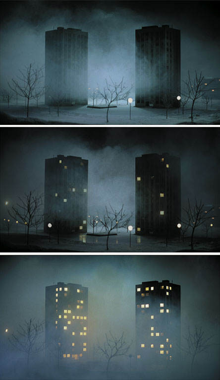
After spending sometime with an outdoor sculpture which will feature in tomorrow's gallery talk I was refreshed and revitalized with the warm and bright afternoon Chicago sun. On my way back to my desk I decided to view Pierre Huyghe's Les Grandes Ensembles (The Housing Projects), a work that had been up for a few weeks but one I hadn't had the chance to see it yet. I opened the door and turned the corner only to find myself blinded by darkness. My senseless eyes, not having the time to readjust to the light from having been outside, forced me to feel along the walls in the terror that I might accidentally grope an unsuspecting visitor. When I thought I had finally reached the black box area I stood and watched for a while. I could only hear the sounds of lo-fi electro music pumping away as the soundtrack. After a while I wondered why the video had not started or if the black screen for several minutes was part of the experience. A sudden light from the corner of my eye revealed that I had been staring face to face with one of the walls of the black box. I hadn't even made it around the corner.

My vision finally adjusted around the second loop of the film. The subject is almost fitting to the experience of my retinal rods lazily stretching their limbs in no hurry to come to my aid. One sees two buildings. The time is presumably dusk and the cityscape is stark, almost bleak. As the electronic music pumps louder and stronger lights flicker across the windows looking like a time-lapsed film. The setting is devoid of human forms, we have only the on/off of interior lights as an index to the human activity within. The whole film takes place in the dark at night. We follow from dusk til dawn (it was dawn that, appropriately enough, let me see the light--cue Sunday hymn) and the bustling of the goings-on inside the two buildings. We can only wonder as to what the night brought each of the building's inhabitants. The wind blows and rocks one of the trees at its trunk. One comes to realize that these aren't buildings at all but small models the artist has built and wired to give the flickering light patterns that dance up and down each story of the building.

In a way, the fact that no human figures are present in a film where for a good part we believe we are watching traces of their activity is fitting to the black box experience. Always a box, always black and always with the volume turned up, it cuts off all other visual stimulation to focus our vision and hearing on the piece at hand. It takes over our entire sensory experience. People spend more time with video pieces (if they chose to enter the black box) than with any other work they will have encountered in the museum. They want to see it through to the end. Maybe watch it again. The black box triggers the cinematic experience in us so we watch to see it from the beginning and sshhhh--! no talking! Our traces and activity are silenced like the figures in the film. We want to know what the people in the buildings are doing but not bump into, touch, hear or be aware of the humans around us--something one can never experience in the white box.

While I couldn't find a copy on YouTube, here are some stills.

Monday, August 2, 2010

Five Tureens

For too long I have harbored the desire to give a gallery talk on Gravy Boats. With a bit more decorum I present 5 tureens from the collection. Tureens were a must of any table service in the 18th and 19th century. Typically one would serve soups, meats or any main dish out of the deep oval boat. They would also be the centerpiece (as seen best in #2) to a matched set that would include cruets, serving platters and other accessories to the meal. Dinners were grand and lavish for anyone that could afford a service from any of the manufactories featured below. One would also find on the table sugar-spun sculptures, porcelain figures, flowers and elaborate decorations that would make any banquet a spectacular show!


1. Pont-aux-Choux Factory (French, founded 1743), Tureen with Cover and Stand, c. 1750, earthenware with lead glaze

This tureen is in gallery 233 and it is one of my favorite examples of late Rococo curves. The form is heavy and weighted down, giving the appearance of sweeping and drawing out lines, rather than the tight, winding curls that so characterize the Rococo style. This tureen is somewhat unusual in that it is earthenware. Dinner sets like this were typically of the pricey porcelain, less so heavy earthenware that was prone to breaking easily. Louis XV levied a luxury tax that restricted the luxury goods of aristocrats and forced many to give up their silver table service, (one of the many acts that proved surprisingly unpopular). Many noble families commissioned earthenware versions of the relinquished silver centerpieces no longer gracing their tables.


2. Meissen Porcelain Manufactory (German, Founded 1710), Centerpiece and Stand with a Pair of Sugar Casters and Oil/Vinegar Cruet, c. 1713, hard-paste porcelain, polychrome enamels, gilding, ormolu mounts

Founded by August the Strong and the predominant furnisher of his court services, the Meissen Porcelain Manufactory was one of the most luxurious porcelain makers of the 18th century. This may be one of the more ostentatious examples of 18th century tastes in tableware. The centerpiece (consisting of the serving platter, cruets and tureen) displays the 18th century taste for chinoiserie, or, motifs, forms and imagery that evokes China or Chinese art. Typically a fanciful take on the far east, the cruets of this centerpiece display a kissing couple in theatrical Chinese costumes while exotic birds grace the ends of the tureen. This work was created at the height of French interest in and taste for all things Chinese. It is an example of a typical French courtly form with chinoiserie frills but other ceramics would take the form of imitation Chinese wares. Even the use of hard-paste porcelain was an attempt to replicate the sophisticated ceramic technology of China which was not known in the West until the early 18th century.

Notice the little black blob at the bottom of the tureen? Right next to the pink peony flower is a small fly painted on by one of the artists who enameled this piece. It would have been the delight of the keen invitee to a lavish banquet!


3. Chelsea Porcelain Manufactory (English, c. 1745-1784), Tureen with Cover, 18th century, soft-paste porcelain with polychrome enamel decoration

The Chelsea Porcelain Manufactory specialized in soft-paste table wares that evoked all sorts of delightful captures of the world around. From turnips to pheasants, hens and rabbits, this Cauliflower-shaped tureen is an unexpected addition to any table. It would have delighted dinner guests as "a most curious dish," as one guest remarked of a Chelsea tureen in the shape of a boar's head. I would only hope that such a dish would serve my favorite Jamie Oliver recipe for Cauliflower and Cheese Soup!


4. John Bridge (English, 1755-1834), Tureen, 1823/24, Silver with repouseé cast, applied and chased decoration

After George IV arrived to the regency of the Kingdom of Great Britain and Ireland in 1811. His opulent lifestyle matched the sumptuous style of the decorative arts. The first-half of the 19th century saw a rise in revival styles where artisans looked back towards historical styles for eclectic inspiration. This Rococo Revival piece captures the enthusiasm for the natural forms that inspired the 18th century Rococo style. The word "rococo" is of 19th century origin. In French, it derived from a mish-mash between the words rocaille (stone- or grotto-like) and coque (shell). With its triton blowing a conch shell over a fantastically large half-shell supported by hippocampi (mythical sea-horse creatures), this is a wonderful example of the back-lash against the neo-classical revival style so popular at the turn of the century in Europe.


5. Christopher Dresser (English, born Scotland, 1834-1904), Tureen with Cover, c. 1880, electoplated silver, ebony

One of the pioneers of modern design, Christopher Dresser traveled widely throughout Japan, studying Japanese interiors, temples and art forms. Upon his return he not only published on Japanese art and architecture but brought a simplicity of design to his table pieces. Not only were his works hallmarks of modern sensibilities, like hygiene, cleanliness and simplicity, but were examples of modern technology as well. The electoplating method was harness by the English in the 1830s but wasn't widely used. It involves using an electric current to reduce the cations in any given metal. This process made the silver surface immune to the typical drawbacks of silver such as tarnishing and an easy scratched surface. Electoplated silver did not corrode, tarnish and was resilient towards surface damage, making it the perfect addition to any modern home. Ebony details on this tureen made it a luxury object that could withstand the wear and tear of frequent use.

So next time you're dishing up some grub for your guests, be glad that it isn't out of a porcelain boar's head!

Friday, July 30, 2010

Monsters of Modernity

It was about a year ago that I went downstairs to the packing department with our Museum Education Summer Interns. The packing department, headed by Johnny Mo, one of the biggest personalities at the AIC, is in charge of creating boxes, crates, foam supports and anything else needed to customize a container capable of handling and protecting its charge for shipment.

On an unassuming wheeled cart, lay an opened red crate. The interior was cut, molded and shaped into the perfect nest to hold a work that I knew but had only ever seen in print. It is a early 13th century limestone sculpture, a fragment of a head, that used to be on view but was taken down before my time here. But there it was. Though its temporary home (its carriage if you will) was by no means paltry, the experience of seeing a work of art in such a modest context, outside of the glass vitrines, dramatic lighting, laser alarms that BEEP! at you if you get too close was unnerving. I could even touch it were the terror of doing so not rending my feeble hands temporarily paralyzed.


It's about 17 inches tall. From a smooth elongated face, two almond-shaped eyes look out past you. The artist has chiseled in fine hairs to make up furry eyebrows but has given this head glossy-magazine-worthy hair that would be the envy of any one affecting the likes of a Hollywood version of a Mountain Man. From the widow's peak down to the beard, the hair spills down in curls and waves. But this is no Charlton Heston as Moses in the 1956 epic, The Ten Commandments, it's the lopped off head of an apostle from the west façade of Notre Dame Cathedral in Paris.

It was no small beans to get to this state in the research, in fact, the story behind this decapitated don is quite a saga.

In 1944 the Art Institute of Chicago acquired this piece from a New York collector. It became one of the most important examples of Gothic sculpture in the museum's collection. But where did it come from before its jaunt in NYC? Legend has it that the cropped cranium was discovered in 1852 during an excavation of the crossing of the Boulevard Haussmann and Boulevard Malesherbes in Paris. From 1943 onwards Notre Dame cathedral underwent several restorations, many headed by the imaginative medievalist Viollet-le-Duc. Many were pleased to see the Gothic cathedral scrapped clean of grime. Others were more skeptical, as writes Bertrall from Le journal amusant in 1856:

At least Gothic monuments do not loose in this [restoration] their appearance of venerable antiquity, keeping their beautiful lines and elegant proportions, but what can one say of the restoration of the old statues that decorate them? The majority no longer have their noses; moreover, on these thin sulfurous, ecstatic dreamers have added the nose of the Apollo Belvedere [classical Greek sculpture unearthed in the 19th c.], this straight nose diving the face, this sensual nose, a pagan nose, a nose that would serve to damn this wise man who presents himself thus re-nosed at the day of judgment. And this newest nose that one could make stands out on the blackened faces [from pollution], strikes the eye, troubles the contemplative spirit, evoking goodness knows what idea of masquerade--Gothic with a false nose.

It would seem that our head did not meet such a fate. In fact, after the head was excavated it was transferred to the basement of Notre Dame for storage and there he snoozed until 1900. Little documentation exists concerning this excavation. Was it an excavation or was it unearthed during the extensive rebuilding of Paris led by the Baron Georges-Eugène Haussmann (namesake of the Boulevard near the excavation site).

But we still haven't accounted for where it came from. One clue might be the obvious--it is just a head. Our beheaded beau may have suffered the same fate as the unfortunate statues of kings past who reigned in the King's Gallery above one of the main tympana on the facade. During the Revolution the Cathedral came to be seen as symbolic of monarchical power and the kings featured were the dynasties of French kings from Childebert I to Phillipe August. So along with the royals and nobles who marched up to the guillotine, the regal sculptures of Notre Dame were also cut short a head. The image to the right is an aquatint from 1804 by Louis Lecoeur depicting the coronation of the imperial kings at the site of Notre Dame. The squared structure in front is ephemeral architecture. It will be torn down after the ceremony. The print embodies the early 19th century association of the cathedral with French Royalty.

For about 40 years art historians battled it out over the origins of this head. Some believed it to be from Sens, others Chartres, others were hesitant to anything more specific than the Il-de-France. One postulated that it wasn't architectural at all but rather from a sarcophagus from Lisieux. Comparisons were brought in. In situ survivals were analyzed and still no one was in agreement.

Enter nuclear science.

Specimens from Notre Dame, Sens and others along with the head underwent Neutron Activation Analysis. This is a process whereby samples are irradiated in a nuclear reactor. A chemist can then analyze trace elements of the stone's mineral composition. The results? The head matched samples from Notre Dame.

The head is presumed to be the head of an Apostle from the Last Judgment Portal. With the 19th century replicas in place it is near impossible to localize which body our head would have capped. But now we know that he did look on to passers by from about 1210 to the last years of the 18th century from the cathedral along the Seine. He missed the Baron Haussmann's digging up and wheel-barrowing away the medieval Paris he once knew. His resurfaced life has been a well traveled one though. He recently got to fly back over Paris on his way to Magdeburg, Germany to appear in an exhibition at the Kulturhistorisches Museum. I, for one, know he traveled first class to get there in his red crate.

Wednesday, July 28, 2010

A Few of My Least Favorite Things

Audience members frequently hear me swoon over a number (usually all) of the works I feature in my gallery talks and lectures. I tell them anecdotes, histories and gush over a Rococo curve or particularly charming blush in an 18th century cheek. I read them dramatic excerpts of contemporary poems, Abbot Suger, and sometimes a scathing Salon review.

So I thought it might be interesting to be upfront about a few of my least favorite things. It should be noted that this is entirely subjective (you'll see just how so!). I readily admit that. It's also not to say that these works don't have critical, aesthetic and historical value. It's everything from the Old Masters, Impressionists to very important works in the trajectory of the Avant-Garde. So here goes with none of the charm of Julie Andrews:


1. Pierre-August Renoir, Lucie Berard (Child in White), 1883, oil on canvas

In gallery 201 of the AIC are the masters of high French Impressionism. From Caillebotte to Pissaro to Monet. And in the middle is Lucie Berard, staring vapidly out at the gallery, slightly bored. At age 3 she must have seen so unimpressed by the visitors and masterworks alike. Lucie was one of Renoir's favorite of the Berard children to paint. The youngest daughter of a Parisian banker, she was betrothed to a civil engineer at the age of 25 and one of her sons became an influential Surrealist poet. And she lived a long life, dying just before her 97th birthday in 1977. Yet her image in mottled ultramarine blue, splotched with peachy pinks belies any charm intended by the bubblegum color palette. Looking more like an alien wearing the mask of a child and puppetting a chemise, the Child in White will always make me uneasy.


2. Joos van Cleve and Workshop, The Infants Christ and Saint John the Baptist Embracing, 1520/25, oil on panel

The scene of the Holy Infants Embracing is a typical subject for Netherlandish panel painting in the 15th and 16th century. The subject derives from the biblical narrative when St. John the Baptist and the infant Christ meet outside of Egypt after escaping the Massacre of the Innocents. There are so many things I enjoy about this work: the delicately brushed landscape in the background, the lamps of carved sardonyx, the delicate gems that hang from the red silk canopy, even the feathered griffin feet supporting the architectural frame. But I don't know what Joos van Cleve or one of his assistants were thinking when they mucked up the shadows of what should be fleshy baby fat with an overzealous amount of burnt umber. The used so much there must have been none left to shade in the holy infants' coifs. Where one is used to seeing wispy curls of blond one is met with awkwardly gelled pincurls of out-of-the-box red hair. Those who have left ammonia hair color in their hair too long (or not long enough) recognize that shade of orange. I speak from experience and it's not the kind of experience I want associated with what should be a charming devotional panel painting.


3. Ferdinand Hodler, Day (Truth), 1896/98

Part of me feels that I should not be legally allowed to post this on the internet. The reason for this uneasy feeling is the very reason why I despise this work. Displayed below and around this work are some exquisite examples of fin-de-siecle and turn of the century decorative arts which I cannot enjoy because of their mere proximity to this piece. I cannot admire the lines and craftsmanship of the art nouveau Austrian side chairs for fear that I will accidentally look up at this piece, and even worse, someone might catch me looking at this piece. The model, Berthe Jacques, would be the fourth in a line of model-mistress-wife's in the artist's career. A deeply Symbolist painting, it surely captures that maxim of the "ugly truth."


4. Antonio Mancini, Resting, c. 1887, oil on canvas

Resting. Yes, we're all sure of that. Though, I can't tell if it's from a recent bout of scarlet fever or consumption (tuberculosis) or something more lewd. The smutty, thick paint echos the stale heat of the sick room she lies in. I can only imagine that the various glass bottles must contain horrid 19th century potions. Whatever she has just experienced, it seems to be ignored by the swooning and adoring sighs people let out when they see it.

Friday, July 16, 2010

Before and After

Museum Educators, when not educating others, educate themselves. So I conceived for this blog the idea that I would post about objects I knew about in the galleries but how fun to mix it up from the beginning. One thing I often tell first-time visitors to the museum or people uncomfortable interpreting art on their own is that you already have the tools and skills to understand and interpret works of art. Keeping in mind that there is no one definite conclusion about artworks, it's a great thought to plant in people's minds to make them more comfortable in galleries where the artworks can be more challenging and difficult to penetrate.

So I wanted a taste of my own medicine. At the Art Institute of Chicago an exhibition of Contemporary Art, the Collection of Donna and Howard Stone, recently went on view. I wanted to select a work that I had no prior knowledge about and record my observations before and my findings after some research.


Before


It is made of cut black felt. Cut very precisely. It hangs on the wall and takes up the entire wall space. It reminds me not just of drips of paint but controlled drips of paint very much like Jackson Pollocks action paintings from the 1950s. Perhaps it's a modern take on the Abstract Expressionists who attempted to free painting from any real-world reference or narrative or subject. Instead they tapped into their individual emotions and even subconscious (many were either reading Freud and Carl Jung or knew them in pop-theory).

This in fact may be the opposite of that. While Pollock gestured wildly, stepped all over his canvas, poured, slung, splattered and dripped paint across the surface this is meticulous. It's slow, careful and calculated. (Don't run with scissors!)

I even wondered if this was a 1960s female artist. A comrade of Eva Hesse? There was a generation of female artists in the 1960s and 70s who challenged the AbEx'ers, their masculine gestures and intuition, by using materials traditionally associated with women (fabrics and weaving).

I wondered if it ever had to be de-linted in the show. Black felt must attract a lot of dust.

Time to read the label:

Arturo Herrera (Venezualan, b. 1959), Let me Go, 2000, wool felt

After

Ok so kind of off. And Arturo Herrera is a pretty big name in contemporary art. The kind of name that makes me go "Oh yikes...should I have known that?" He's a name I know but know little about I will admit. And an intriguing title as well. "Let me go" is unexpected. Looking at it a bit longer I see that the "drips" I saw before look like dappled light coming through a thick forest. So it's time to hit the files.

Arturo Herrera is a contemporary artist interested in abstraction, particularly finding forms which are unrecognizable and with no specific meaning. His works not only relate back to the drip and action paintings of the Abstract Expressionists (who also wanted to eliminate recognizable subjects in their works) but also to the Pop Artists of the 1960s (Roy Lichtenstein has a painting of a splatter at the Art Institute looking as if it were printed rather than painted or actually splattered). Hi works are carefully conscious of form in terms of formal aspects such as line, color, balance and an overall sense of composition. (Look at the heavy, more dense left side of the work compared to the spindly, detailed areas in the middle).

But we are able to bring our own conclusions to this work. "It’s a bridge, but it is paved with the viewer’s own references and associations," the artist says of his own work.

He looks at graphic design of today, particularly comic books and big billboard advertisements (think of the large scale of this piece). But these examples of graphic design are all about specific ideas ("Buy this product!" or in the case of comic books "Swoosh!").

Herrera notes "the graphic has specific messages—it’s political, or it’s advertising. It is successful if it gets its point across. My work actually tries to discourage a specific message. It tries to free a place up, to clarify through ambiguity. I use strategies of design and placement to enable the viewer to access the image."


Let me Go


So this sheds some light on the subject. "Let me Go!" almost rings like a phrase from a comic book or even...a Roy Litchenstein painting.
(Roy Litchenstein, Ohhh Alright, 1964) The phrase has the same curtness that suggests it's a part of a larger dialogue or narrative but we as viewers don't know the before and after. Who is saying "Let me go?" Is it a "Let me go!!" or a "please...just let me go now." Now its up to us to bring our own baggage to the table.


It lingers somewhere between painting and sculpture. It looks like paint but is sculpted felt dangling off the wall. It's very flat but it isn't 2-D. Several areas buckle off the wall. And I found that with this work especially, its ok if you don't have the answers. You have it all in your back pocket. How appropriate for a work about letting the viewer vacillate between knowing and not knowing, wanting to know more and filling in the gaps.

Thursday, July 15, 2010

The other Saint Bacchus


Designer: William Burges, 1827-1881
Painter: Nathaniel Hubert John Westlake, 1833-1921
Maker: Harland & Fisher
England, London

Sideboard and Wine Cabinet, 1859

Pine and mahogany, painted and gilded; iron straps; metal mounts
126.5 x 157 x 58 cm (49 3/4 x 61 3/4 x 22 3/4 in.)

In the European Decorative Arts gallery at the Art Institute of Chicago is a wine side board, a cabinet for storing wine and wine accessories done in the latest fashion. The 19th century witnessed a trendy taste for the gothic. Artists and writers turned towards the middle ages and incorporated window tracery, stained glass, gargoyles and romance characters like Tristan and Isolde into their homes, theatres and galleries.

The artists here, Nathaniel Hubert and John Westlake, looked to medieval manuscript illumination and its brightly colored, flat and graphic style to add a stroke of the past to this cabinet. As if taken directly from a manuscript, richly ornamented architectural designs frame scenes from the life of Saint Bacchus. Something we might expect to see in an illustrated haigiography, or written account of the life of a saint, from the middle ages. In the first two scenes we see followers venerating the saint. They bring him alms, kiss his hands and sing his praises. In the next scene we see the martyrdom of Saint Bacchus. He encounters a band of ill-meaning folk who shove him into a wine casket. His story ends with a perhaps unassuming man taps the casket for a glass of wine and instead of drawing wine, draws the blood of the saint.


Seemingly appropriate subject matter, and tempering as well, for a wine cabinet save for one small problem. This was not the life of Saint Bacchus! Saint Bacchus was a third century military saint, an officer in the Roman army who refused to enter a Roman temple and pay homage to Jupiter. He, along with his companion Sergius, were chastised by being paraded around town in womens clothing (I imagine something from Monty Python's Flying Circus) and eventually executed. Together, St. Sergius and St. Bacchus were highly venerated saints particularly in Byzantium where a church still stands next to the train tracks along the sea in Instanbul (now called Kucuk Aya Sofya).

So it turns out that Misters Westlake and Hubert were a bit clever in their rending of the Saint's life. If that wasn't enough to give the to-be wino a hearty laugh maybe the cartouches, or roundels, around the second register might. We have the portraits of several noble-looking folk, perhaps knights and ladies. The artists did their homework and rendered these chivaric faces against red and blue backgrounds and labeled them with abbreviated lettering as one finds in latin and greek medieval inscriptions. Sounding them out, we find that not only are they in English but they bear familiar names: PORT, SHRY, BRGNDY or rather port, sherry, burgundy the names of wines one might hope to find in the cabinet. If that isn't clever enough, the artists paired the color of the hair to the darkness of the wine they represented.

Its an extremely fun and unusual object indeed. It featured in the 1862 International Exhibition in London was was presumed to be lost for quite some time. It now rests next to a model chalice by the neo-gothic proponent, Pugin.